TK
KTL

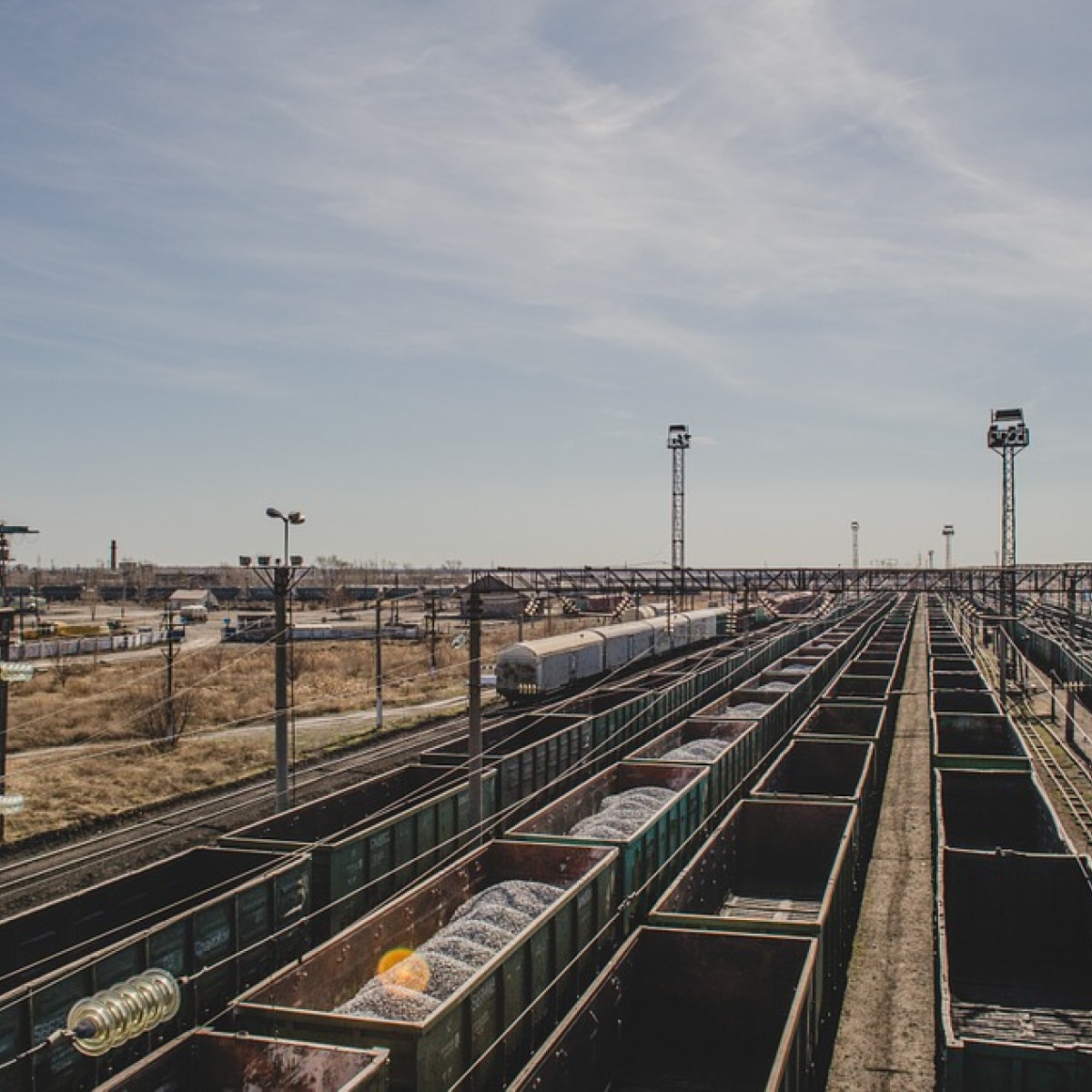
We had the task create a corporate website for TC KTL — a freight forwarding company in the field of rail freight, which helps Ukrainian companies to quickly and reliably deliver their products anywhere in the country.
It was necessary to create a corporate B2B site from scratch, which will improve the company's image, increase visibility among partners and potential customers, and most importantly, help sell more and more conveniently
We first understood the company's business processes to understand what tasks need to be solved with the help of the new site. Then created a UX-prototype, which tested the logic of user interaction with the site. Marketing solutions, texts and functions are wrapped in a visual and technical concept that refers to rail transport
Visual
Key pointsUI
If you scroll the page down, the menu at the top disappears so as not to take attention. But when the user intuitively directs the cursor there, the site «guesses» this action, and shows the menu button in advance
Form
When sending an application through the form, for example, it comes not only by email but also to the Telegram bot. This helps don’t lose the application if the manager went out to dinner, for example, or simply didn’t receive an email
We added the interface sounds. When user clicks on the active item (feedback button, for example), the user will hear a branded sound. This solution improves the user experience and is remembered at the subconscious level
Mobile
In today's world, mobile design is as important as desktop
